

Why Coverage Maps Exist - and What They're Actually Based On
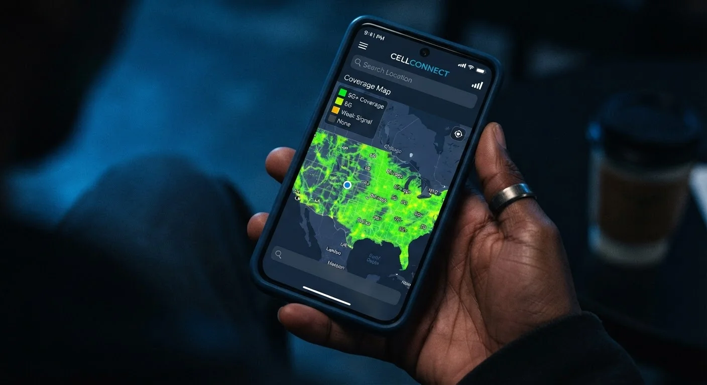
Every major wireless carrier publishes an interactive coverage map, and they all share the same fundamental limitation: they are models, not measurements. Carriers generate these maps by combining tower location data, antenna configurations, terrain elevation, and radio propagation formulas to estimate where a signal should theoretically reach. The result is a prediction, not a verified snapshot of real-world conditions.
That distinction matters enormously. A colored region on a map means a carrier's algorithms expect a signal to be detectable in that area under baseline assumptions. It does not mean you will make a call, stream video, or send a text without interruption at any specific address within that region. Understanding this gap is the starting point for reading any coverage map critically.
To understand why signal strength varies so dramatically even within covered zones, it helps to know how spectrum bands shape wireless reach - something we break down in depth in our guide on how carriers divide up the U.S. spectrum.
Common Misconceptions About Coverage Maps - Debunked
Carriers present these tools in ways that encourage confidence, and that framing has produced a set of persistent myths among consumers. Here's what the data actually shows.
Myth
If my address is inside a shaded coverage zone, I should expect full, reliable signal indoors.
Fact
Coverage shading indicates outdoor signal predictions. Indoor performance depends heavily on building materials, which can reduce signal significantly.
Concrete, metal framing, and low-emission glass - common in modern construction - all attenuate radio signals. A building's structure can drop signal strength by enough to render a strong outdoor signal weak or unusable inside. Carriers model outdoor coverage because indoor variables are too numerous and location-specific to predict at scale. If your primary need is indoor coverage at a specific address, the map alone cannot answer that question reliably.
Myth
A 5G label on a coverage map means I'll get fast 5G speeds in that area.
Fact
5G coverage zones on carrier maps often include low-band 5G, which offers speeds comparable to - or only modestly faster than - 4G LTE.
5G is not a single standard - it spans multiple spectrum bands with very different performance profiles. Low-band 5G travels farther and penetrates buildings better, but its speed advantage over LTE is modest. Mid-band and high-band (millimeter wave) 5G deliver dramatically faster speeds but cover much smaller geographic areas. When a map colors a rural county as '5G covered,' it almost always refers to low-band deployment. Carriers are not always explicit about this distinction on their public-facing maps.
Myth
Coverage maps are updated in real time, so they reflect current network conditions.
Fact
Coverage maps reflect planned or recently deployed infrastructure, not live network load or outage status.
Map updates typically lag behind real-world changes by weeks or months. More importantly, a map cannot show you that a tower is under maintenance, that a weather event has disrupted service, or that your area's network is congested at 6 p.m. on weekdays. Network congestion - too many users sharing the same tower at the same time - is one of the most common causes of poor real-world performance in areas that appear well-covered on a map.
Myth
Two carriers showing coverage in the same area will deliver similar performance to each other.
Fact
Coverage overlap does not mean equivalent performance - spectrum holdings, tower density, and capacity investments vary significantly between carriers.
Even when two carriers both show a region as covered, the quality of that coverage can differ considerably. One carrier may hold more mid-band spectrum in that market, giving it a throughput advantage. Another may have denser tower placement in urban cores but thinner coverage at the edges of metropolitan areas. The colored map layer compresses all of these variables into a binary covered/not-covered display that obscures meaningful performance differences. Crowdsourced network performance data, published periodically by independent research organizations, offers a more useful comparison.
Myth
MVNO customers get the same network experience as postpaid customers on the same towers.
Fact
MVNOs are typically deprioritized behind host carrier's own customers when a tower is congested.
An MVNO - mobile virtual network operator - leases access to a major carrier's infrastructure rather than building its own. That arrangement usually includes a traffic priority clause: when tower capacity is constrained, the host carrier's own postpaid subscribers get bandwidth first, and MVNO traffic is deprioritized. In practice, this means MVNO users can experience noticeably slower speeds during peak hours in busy areas, even though they're technically on the same network the coverage map depicts. This is a contractual and technical reality, not a malfunction.
~30 dB
Typical indoor signal loss through walls
Radio frequency engineering research consistently shows building materials can attenuate cellular signals by 10-30 dB or more, substantially reducing indoor coverage.
3
Distinct 5G spectrum bands in U.S. deployments
The FCC recognizes low-band, mid-band, and high-band (millimeter wave) 5G deployments, each with substantially different speed and range characteristics.
What to Do Instead of Trusting the Map Alone
The most reliable signal test available to any consumer is direct experience. Before committing to a carrier, look for plans that offer a free trial period - many now provide one to two weeks. During that window, test your phone at your home address, your regular commute route, and any location where connectivity is critical to you.
Word of mouth from neighbors or coworkers who use the same carrier at the same address is often more informative than any map. Crowdsourced coverage databases also aggregate real-user speed tests, providing a ground-level view that carrier-published maps cannot replicate.
Don't Assume Coverage Equals Usability
A location appearing on a coverage map as 'covered' does not guarantee that calls will connect or that data speeds will meet your needs. Terrain features like hills and valleys, distance from the nearest tower, and simultaneous user load can all degrade performance well below what a map implies. If consistent connectivity is critical - for remote work, medical monitoring, or safety reasons - verify coverage through direct testing before committing to any carrier or plan.
If you're choosing a plan through an MVNO - a carrier that resells network access rather than operating its own towers - be aware that your experience may differ from what the host carrier's map depicts. MVNOs typically get lower network priority during congested periods. Our explainer on what terms like MVNO and throttling actually mean walks through exactly how that works. And before you sign any plan, it's worth reviewing what the fine print in your wireless plan is actually telling you so deprioritization clauses don't catch you off guard.
The content on this site is provided for informational purposes only and should not be considered a substitute for professional advice. While we strive to provide accurate and up-to-date information, we make no guarantees regarding its completeness or accuracy. Always consult a qualified professional for advice specific to your circumstances before making any decisions.